Rebrandify: Behind the scenes of Expensify’s new design system

You’ve probably heard about New Expensify: the next-gen Expensify app that’s your one-stop-shop for all things involving money and collaboration, which is to say, all things. You can send and request money, chat with friends and teammates in individual and group conversations, and so much more.
However, as New Expensify started to come to life, we realized that our old way of approaching design wasn’t quite up to the task. So we set out to build a new design system for the new world of Expensify – a brand that can carry our product into the future, and express our collective personality along the way.
Defining the problems
As with all Expensify projects, we started by writing down every single problem with our design methodology, getting as specific as possible. For example, our color palette didn’t have enough range or depth and was hard to layer.
We didn’t have a headline font, which led to different fonts used across different assets, which led to the biggest problem underlying our old way of designing: inconsistency. We ended up with a long list of problems that we wanted to solve, covering every aspect of our design language.
Exploring possible solutions
We teamed up with The Collected Works, a boutique design agency known for creating a vibe, to collaborate on a new design system. We started off by exploring the widest range of design solutions we could imagine, ranging from close-to-home to totally crazy.
After weeks of explorations and experimentation, this is where we landed.
The final product: A design system that can bend and flex as much as Expensify
We made this design system with the goal of creating a cohesive way to express the Expensify personality across the board, no matter the use-case or medium.
From a luxurious ExpensiCon in Italy, to accounting conferences in Las Vegas, to billboards around the country, to daily social media posts, and above all else, the Expensify app – anything Expensify says or does visually should look and feel like the Expensify we know and love: bold, courageous, innovative, and easy to understand.
Color
We’ve fantasized about creating a dark mode for years, but wanted ours to be a little different. So we chose green as the hero color, with various greens represented throughout our product. We also expanded on our previous color palette to create a more complementary and playful range of shades that can bring personality to text-only designs and also work for intricate illustrations.
With so many new colors to work with, we chose a few primary color combinations and established usage guidelines, which allow for plenty of flexibility while maintaining the cohesion that was integral to this project.
Illustration
To figure out what we wanted our new design system to emulate, we asked ourselves, “What’s the coolest thing we’ve ever done?” The answer was pretty obvious: our 2019 Super Bowl commercial, which included a full-length music video featuring 2Chainz and Adam Scott. So we set out to make all of Expensify look like that. Specifically, we wanted to take inspiration from and expand on the animated universe created for the music video.
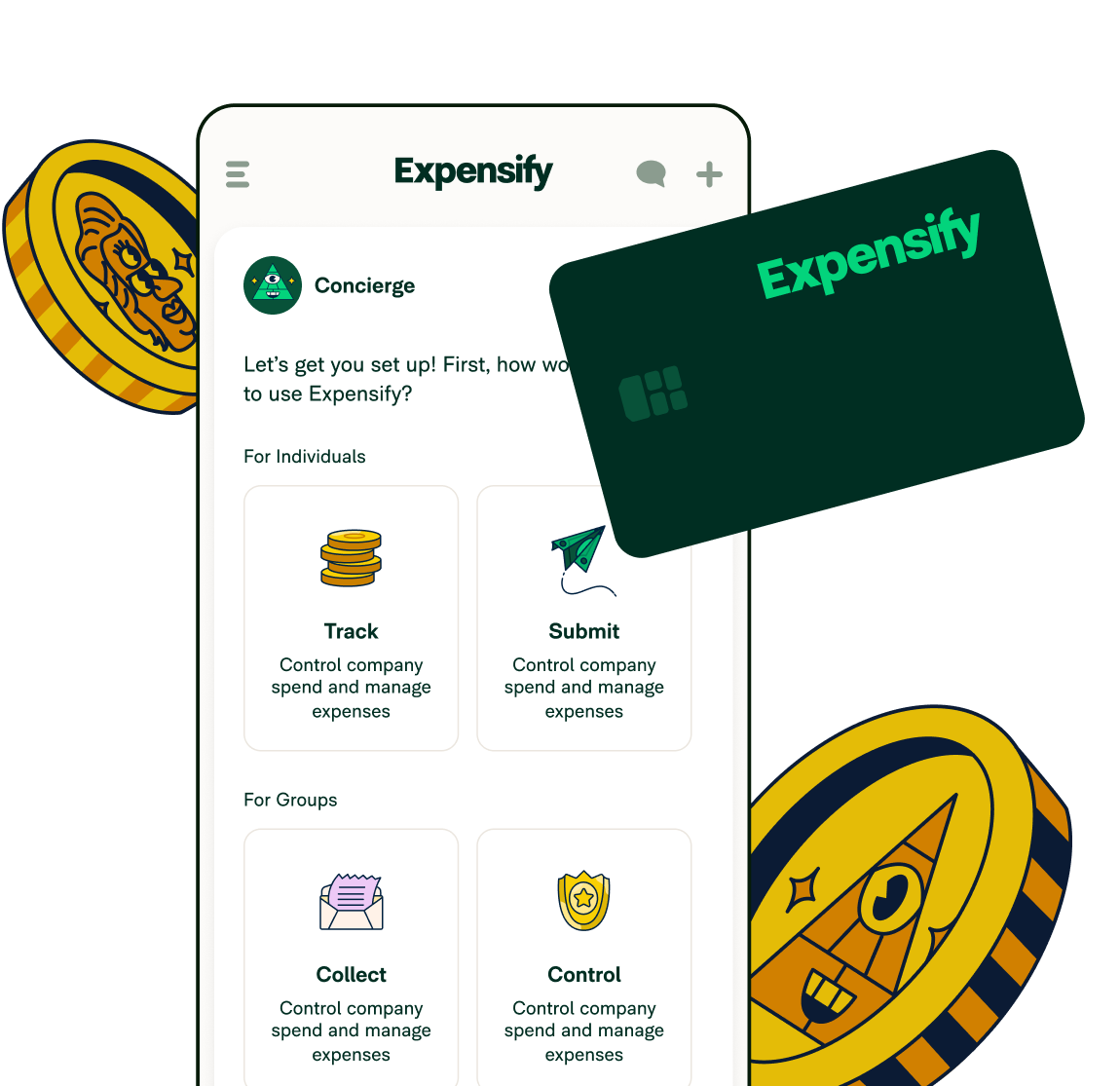
We teamed up once again with Augenblick Studios, the artists behind that animated sequence, to create a world of illustrations. Illustrations that capture the wackiness that is expense reporting and the magic of collaboration. This illustrated world represents the world we’re trying to build through Expensify. A world where you can be weird, vibrant, and totally yourself, but always with a purpose.
Iconography
Once upon a time, the original Expensify logo included several symbols from the well-known AIGA icons: the same symbols you might find in an airport on signs showing you where to find a taxi, a food court, or your airplane.
Our previous icons all derived from this set, which didn’t make much sense after we dropped the icons from our logo several years ago. With this rebrand, we decided to freshen up our icon set to create something unique to Expensify, while focusing on informative simplicity.
Typography
Last but certainly not least, typography is one of the most important pieces of our design system. Our new customized type families, Expensify New Kansas, Expensify Neue, and Expensify Mono, pair harmoniously to balance the fun and the functional.
We worked closely with two type foundries, CoType and Newlyn, and obsessed over every minuscule detail of every single letter. The result is a set of typefaces that can flex from the serious to the surreal, while maintaining their character throughout all uses.
Product design
Most important of all, we’ve fully redesigned the Expensify user experience with equal emphases on ease-of-use and joy-of-use. We fleshed out every detail down to the sound you hear when you submit an expense report, all with the ultimate goal of making financial collaboration not just frictionless, but also fun.
Bringing it all together
With all of our main ingredients in place, we played around with how to use them all together, aiming for a style that doesn’t overwhelm, but that still retains the playfulness and power of our brand voice.
With a wide range of layouts, ranging from the most minimal and utilitarian to the highly expressive and creative, we can generate a variety of assets that feel consistent, whether you’re viewing them on a phone screen or on a billboard.
What’s next
Well there it is, a brand new look for a brand new Expensify. We hope that our new design system gives you a little hint of what’s to come in the land of Expensify, and that you enjoy this new visual world as much as we do.


